Development
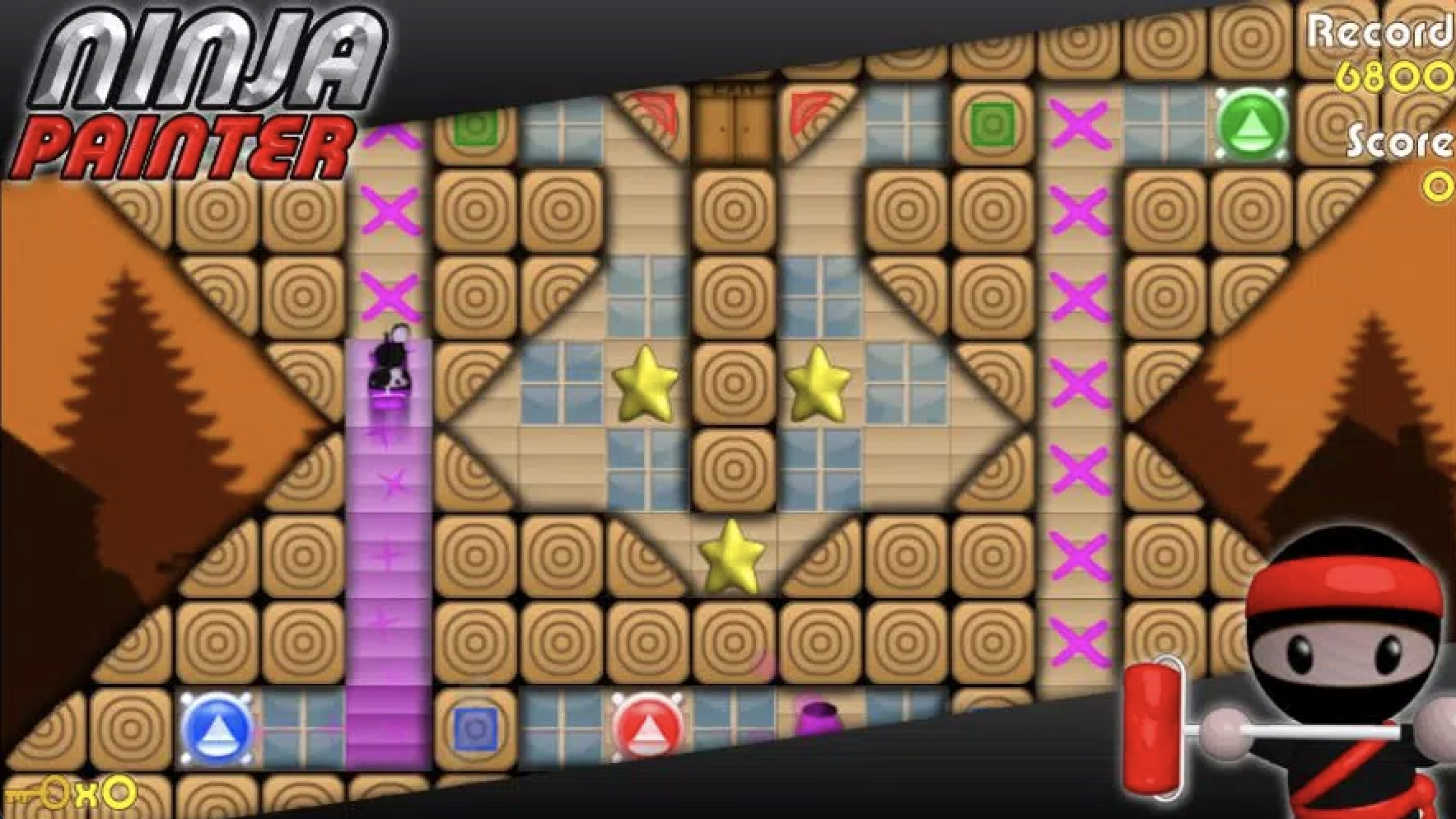
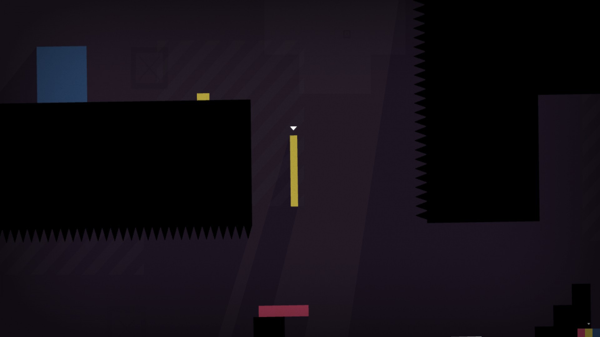
From the beginning, we wanted to create a game that has a relatively unique way of playing and brings a refreshing experience to the players and move away from traditional wasd keyboard games. The main inspiration for the mechanics came from two games. One is Ninja Painter, where the player swipes the ninja and the ninja will paint all the wall blocks it passes through. The other one is Thomas was Alone, which is a puzzle-solving game.


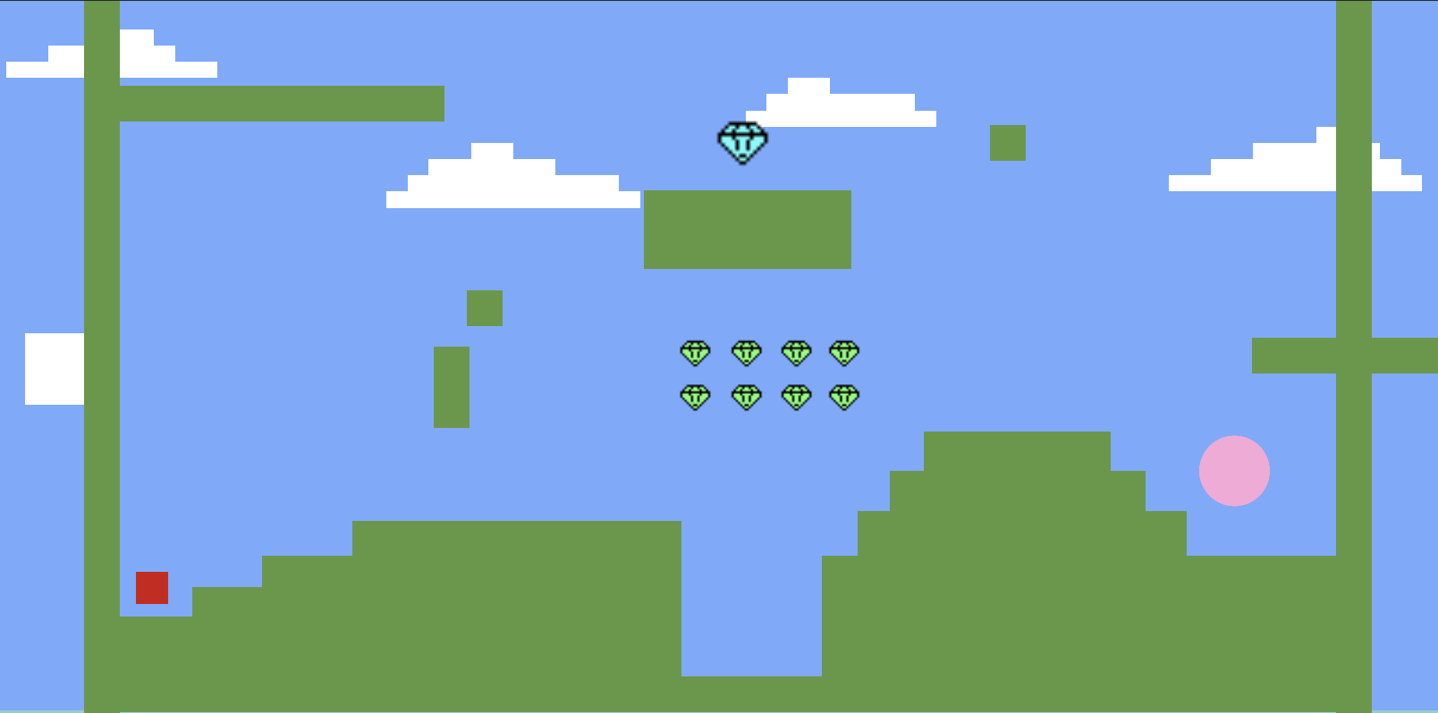
During our first beta stage, we had the swipe player control code done but still were not sure about the story behind the player and the aesthetics. We tried some minimal platform environments during this time shown below:

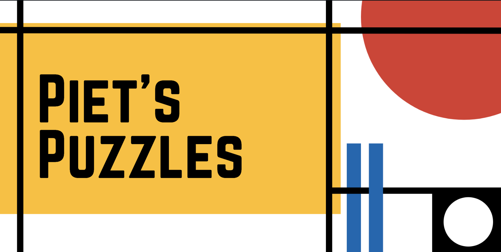
We did not love this because it looked overly generic. Although the feedback was mostly positive that people liked how it is a minimal and pixelated world, we kept searching for a better theme and a storyline. We were asked to think more on the artistic theme of our game. In the process, we set our eyes on Piet Mondrian's painting, because of its simplistic style and how the horizontal and vertical rectangular blocks and lines fit into the logic of our game.
By the second Beta playtest, we have our levels set up to be the classic Mondrain painting. We also created a mini Piet character and set the story so that mini Piet would escape through different Mondrian painting puzzles to get by its day. We received acknowledgments on the theme and constructive feedback on the other aspects. People said a "reset" level functionality would be helpful if Piet is stuck in a position where it cannot get out. We received requests for menu scene and some measurements on time to make the game more playable repeatedly to complete each level. We also had to fix few bugs such as player zooming off the screen and adding more sound effects.
We took these feedbacks into account and implemented the time elapse counter and reset button for every level. We also adjusted the look of our levels into the current theme: a Mondrian-styled map set in themes such as the house, the bus, etc... This added a storyline to the game, and we were very satisfied with it.
After our final presentation, we worked really hard in the following 24 hours to polish up the game on the major feedback we received.
In terms of gameplay, we added the swipe counter per popular request. After our adjustment, players now can measure their performance based on a few different metrics: time, the number of swipes, and coins collected. They can choose to pass as fast as possible, or try to plan out the least number of moves, or collect all of the coins. This adds more dynamic and player interaction to each levels.
In terms of visual, we remade all of our backgrounds into pixelated art depicting scenarios mini Piet may encounter during the day. This increases the overall cohesiveness of the game by fitting it into one unified artistic format. We also remade the exit sign into a "mystery box" image with a question mark on all first four levels and an exclamation mark on the last level. Many people also brought up how the portal entrance and exit confused them, so we added a rotating spiral/blackhole on of the entrance portals. It should be intuitive that Piet might be "sucked in" if get close to those squares. There is also more sound effects such as swipe, coin collection, next level, and more. At the last stretch, we fine tuned the position of our texts and buttons, making each level more consistent. All in all, our game changed a lot between all the milestones but the playtesting and in-class feedbacks helped us construct more concrete and reachable game.

Leave a comment
Log in with itch.io to leave a comment.