Piet's Puzzles
A downloadable game for Windows and macOS
Game Overview:
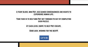
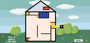
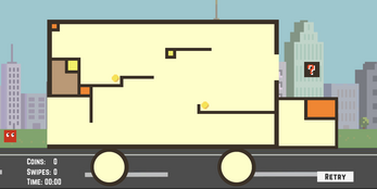
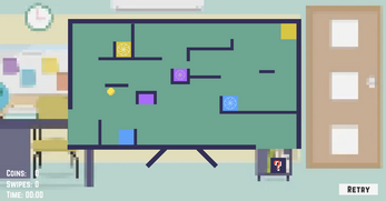
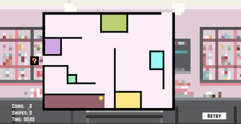
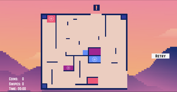
A paint block, mini Piet, just gained consciousness and wants to experience human lives. Your task is to guide mini Piet through the puzzles to complete its regular day. It goes from home -> school bus -> study -> snack -> sunset. Good luck!
Instructions:
- Swipe to venture through each level
- Goal is to escape through open door to reach the mystery box
- Some levels have magic portals, watch out where you enter
Piet's Puzzle is an iOS mobile game. Download our game from our repository here: https://github.com/Zighnou/mobile-game
Attributions:
-Music:
https://www.bensound.com/royalty-free-music/track/buddy
https://www.bensound.com/royalty-free-music/track/sunny
https://www.bensound.com/royalty-free-music/track/littleidea
https://www.bensound.com/royalty-free-music/track/perception
https://www.bensound.com/royalty-free-music/track/onceagain
-Sound Effects:
https://freesound.org/people/Timbre/sounds/221683/
https://freesound.org/people/mrickey13/sounds/515625/
-Images:
http://pixelartmaker.com/art/f8bce75f7e7e039
https://stock.adobe.com/search?filters%5Bcontent_type%3Aphoto%5D=1&filters%5Bcon...
Development log
- PostmortemMay 05, 2022
- DevelopmentMay 05, 2022
Comments
Log in with itch.io to leave a comment.
I really like the idea of the game and how far it came from the demo I got to play in class! I really like the background and how each level has a different one!
The only comment and change I would make is to have the background pictures a little clearer and less pixeled out!
But overall great game and great idea!
The aesthetics of this game! This game is the definition of "sometimes less is more". I love the minimal design and the consistency between the levels. The color choice, the font style and backgrounds just really elevated the game.Loved the idea of the portal! Overall great job.
Overall I thought the game worked really well. The idea of it was good but it was really the execution of the level design that made the game fun. The teleporters were a super welcome addition and added additional depth to the levels and the different settings for each level was really creative. Great job!!
First, I love that the itch page matches the aesthetic of the game. I really enjoy puzzle games and color block stuff like this, so I can 110% see myself ordering this from the app store. One point that I would have to reiterate from class is the entrance/exit portals. It was confusing to tell which portal was for which. Also, since some of the colors on the screen are purely aesthetic for the first few levels, when they start working as portals it got a little confusing. Other than that, the mechanics seemed to work really well and each level got increasingly harder.
I love that the simplicity of the art style is actually what draws you in. Its funny because when you download certain apps that have ads, games like these are always advertised. But I feel this one is more aesthetically pleasing to look at compared to the ones I've seen in ads. I think I would definitely play a game like this constantly after being hooked on like the first 2 levels.
I liked the art style of this game. It is simple yet effective. It reminds me a bit of a modern art piece. One suggestion might be to make the background less blurry as it looks a bit weird. Overall though it was a great game
i love how this group chose to make something different than the obvious shooter that we were all thinking. i think that this made this game really stand out. i think that one potential improvement would be to make the square's sides line up with the boundaries so that it looks a little more deliberate. i think that this would also make the levels a little easier to solve.
Great game overall! I love the color palette and overall aesthetic of each level. Also it's amazing how conceptually simple yet practically challenging the game is.
I thought this was a fantastic game and enjoyed the puzzles. The levels were nice and intricate and the use of the colored portals was a nice addition. I am definitely the type to play this game especially going on a subway. The different backgrounds for each level added on to the design as well.
I really like the overall feel of your game. Every level feels simple yet complex. Every level is appealing and engaging and even though I could know how to solve it I would still play it again. I think the teleporting was a really good addition. I think my only suggestion would be to try and change up the backgrounds because sometimes I think they take away from the game. Overall, I loved the game and idea as a whole.
I enjoyed each level had a different concept. The game reminds me of games I've played before when I'm on the MTA and if this game was released, I could find myself playing it on my commutes on the train. I really liked how there was a teleporting aspect in the game. It took the difficulty up a notch and keeps things interesting. It'll be cool if there are more levels and newer things that get introduced to keep the player on their toes.
I like the design of the game. Though this game seems to be composed of very simple lines and blocks, I can see that designing these levels from easy to hard is more difficult than going through them as players. Each level has a totally different key.
One suggestion will be I found the game background to be a little bit blurry which seems not very compatible to the inner blocks.
It is a great innovation and challenge to combine artwork with a game as you need to balance the visual effect of the artwork with the difficulty of the game. I am really glad to see that you guys make use of the portal mechanics in the color region which is a great idea when the player's control is limited by the rules themselves. One suggestion would be when I watched the demo, I am quite confused as some portals cannot enter again after left, and how I, as a player, are enabled to know that? Or, how can I determine which one of the portals, or which side of one portal, can be entered? I believe more instruction or guidelines can be made so it can be more player-friendly.
I like the aesthetic of your game, it's full of mondrian style. The small eyes of the character is so cute. The teleportation idea is so good, and many interesting levels can be made based on it.
This is such a creative idea for a game. I really like the calmness of this game compared to traditional adventure and shooting games. Also, the idea of the game is really flushed out and matches the storyline you guys created.
The concept behind the game is unique and has a ton of potential. The puzzles are interesting and easy to understand the mechanics. The portals and collectibles offer a lot of potential for some very interesting levels if you plan on expanding the game. The scenes and levels also tell a small story with the house, truck, and monitor as if Piet really is on an adventure!
I like the use of simple lines and geometry for the art, it compliments the linear movement of the character in the game pretty well. The game play mechanics you've laid out like the portals and collectibles have the potential to make a lot of interesting levels. If it's possible, I'd try to find vector versions of the collectibles and exit sign to make them fit more with the rest of the assets.
I really like the exit sign on for the game which clearly shows where to go. I also like the increasing of the difficulty for each level. One suggestion I would give is that it would be more helpful to have an instruction for the game since sometimes the player don’t know what each block would do and they may get a little confused. The background for each level is really adorable.
I really liked the concept behind the game and how each maze matched up with the backgrounds as well! I also really liked the whole idea of the portals within the mazes. Would definitely like to hear some sound animations for the portals in future revisions.
The basis of the game was very intriguing in my opinion, and I also like how the levels are gradually increasing in difficulty. The idea of portals is really cool too, great work!
I like the concept of the game. The theme is interesting and I think you really stick to that style in your levels. I think you could make it clearer to the player that the exit portals have different functionality.
The concept behind this game is so unique and I love how each level incorporates the style of the paintings! I think it would be useful to have a brighter “exit” color since it is such a colorful game and it might be confusing as to how to get out. I really like the concept of the portals as well. Super fun game!
First of all, the idea of the game is very unique and appealing - I tend to really enjoy games where I help something/someone reach a goal. Level select is also a great feature to add in! Reminds me of a painting ninja game I used to play a lot.